A measure of variability is a summary statistic that represents the amount of dispersion in a dataset. How spread out are the values? While a measure of central tendency describes the typical value, measures of variability define how far away the data points tend to fall from the center. We talk about variability in the context of a distribution of values. A low dispersion indicates that the data points tend to be clustered tightly around the center. High dispersion signifies that they tend to fall further away.
In statistics, variability, dispersion, and spread are synonyms that denote the width of the distribution. Just as there are multiple measures of central tendency, there are several measures of variability. In this blog post, you’ll learn why understanding the variability of your data is critical. Then, I explore the most common measures of variability—the range, interquartile range, variance, and standard deviation.
Range
Let’s start with the range because it is the most straightforward measure of variability to calculate and the simplest to understand. The range of a dataset is the difference between the largest and smallest values in that dataset
R = max -min
While the range is easy to understand, it is based on only the two most extreme values in the dataset, which makes it very susceptible to outliers. If one of those numbers is unusually high or low, it affects the entire range even if it is atypical.
Additionally, the size of the dataset affects the range. In general, you are less likely to observe extreme values. However, as you increase the sample size, you have more opportunities to obtain these extreme values. Consequently, when you draw random samples from the same population, the range tends to increase as the sample size increases. Consequently, use the range to compare variability only when the sample sizes are similar.
Interquartile range
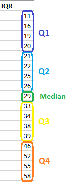
The interquartile range is the middle half of the data. To visualize it, think about the median value that splits the dataset in half. Similarly, you can divide the data into quarters. Statisticians refer to these quarters as quartiles and denote them from low to high as Q1, Q2, and Q3. The lowest quartile (Q1) contains the quarter of the dataset with the smallest values. The upper quartile (Q4) contains the quarter of the dataset with the highest values. The interquartile range is the middle half of the data that is in between the upper and lower quartiles. In other words, the interquartile range includes the 50% of data points that fall between Q1 and Q3. The IQR is the red area in the graph below.
Variance
Variance is the average squared difference of the values from the mean. Unlike the previous measures of variability, the variance includes all values in the calculation by comparing each value to the mean. To calculate this statistic, you calculate a set of squared differences between the data points and the mean, sum them, and then divide by the number of observations. Hence, it’s the average squared difference.
There are two formulas for the variance depending on whether you are calculating the variance for an entire population or using a sample to estimate the population variance. The equations are below, and then I work through an example in a table to help bring it to life.
Population variance
The formula for the variance of an entire population is the following:
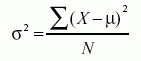
In the equation, σ2 is the population parameter for the variance, μ is the parameter for the population mean, and N is the number of data points, which should include the entire population.
Sample variance
To use a sample to estimate the variance for a population, use the following formula. Using the previous equation with sample data tends to underestimate the variability. Because it’s usually impossible to measure an entire population, statisticians use the equation for sample variances much more frequently.

In the equation, s2 is the sample variance, and M is the sample mean. N-1 in the denominator corrects for the tendency of a sample to underestimate the population variance.
Standard deviation
The standard deviation is the standard or typical difference between each data point and the mean. When the values in a dataset are grouped closer together, you have a smaller standard deviation. On the other hand, when the values are spread out more, the standard deviation is larger because the standard distance is greater.
Conveniently, the standard deviation uses the original units of the data, which makes interpretation easier. Consequently, the standard deviation is the most widely used measure of variability. For example, in the pizza delivery example, a standard deviation of 5 indicates that the typical delivery time is plus or minus 5 minutes from the mean. It’s often reported along with the mean: 20 minutes (s.d. 5).
The standard deviation is just the square root of the variance. Recall that the variance is in squared units. Hence, the square root returns the value to the natural units. The symbol for the standard deviation as a population parameter is σ while s represents it as a sample estimate. To calculate the standard deviation, calculate the variance as shown above, and then take the square root of it. Voila! You have the standard deviation!
In the variance section, we calculated a variance of 201 in the table.

Therefore, the standard deviation for that dataset is 14.177.
Which is Best—the Range, Interquartile Range, or Standard Deviation?
First off, you probably notice that I didn’t include the variance as one of the options in the heading above. That’s because the variance is in squared units and doesn’t provide an intuitive interpretation. So, I’ve crossed that off the list. Let’s go over the other three measures of variability.
When you are comparing samples that are the same size, consider using the range as the measure of variability. It’s a reasonably intuitive statistic. Just be aware that a single outlier can throw the range off. The range is particularly suitable for small samples when you don’t have enough data to calculate the other measures reliably, and the likelihood of obtaining an outlier is also lower.
When you have a skewed distribution, the median is a better measure of central tendency, and it makes sense to pair it with either the interquartile range or other percentile-based ranges because all of these statistics divide the dataset into groups with specific proportions.
For normally distributed data, or even data that aren’t terribly skewed, using the tried and true combination reporting the mean and the standard deviation is the way to go. This combination is by far the most common. You can still supplement this approach with percentile-base ranges as you need.
